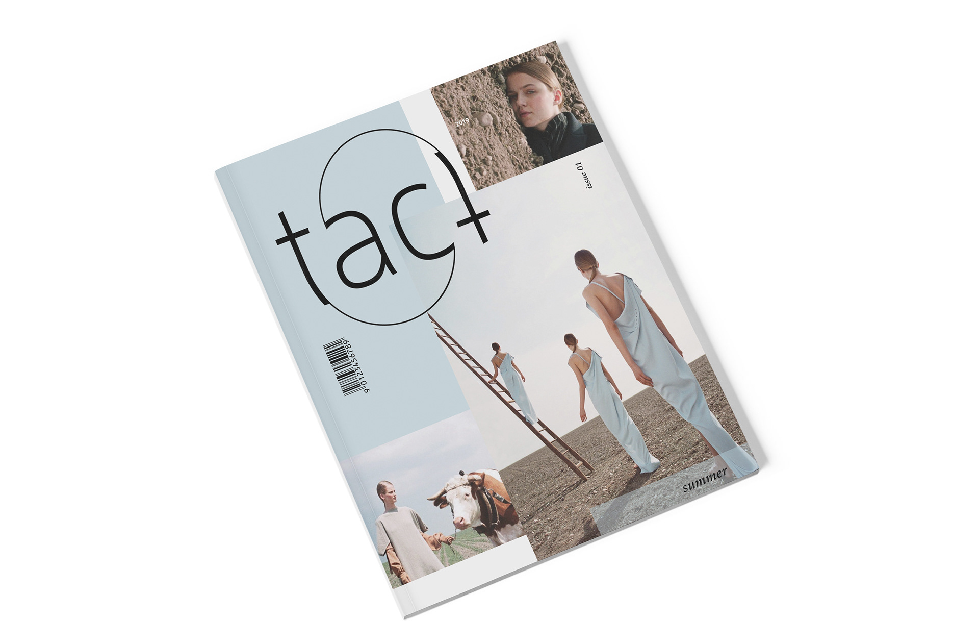
tact magazine
wordmark and publication design
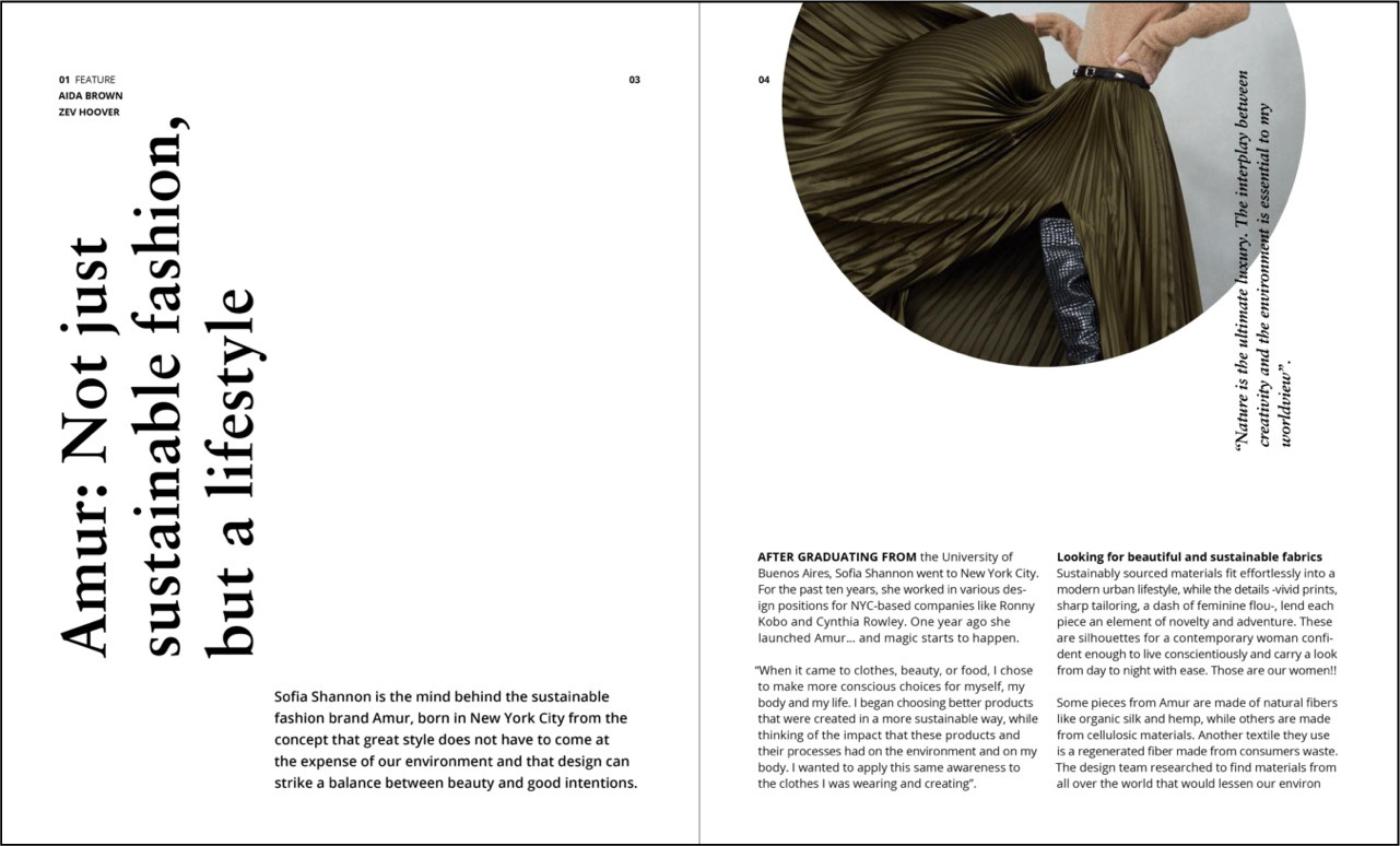
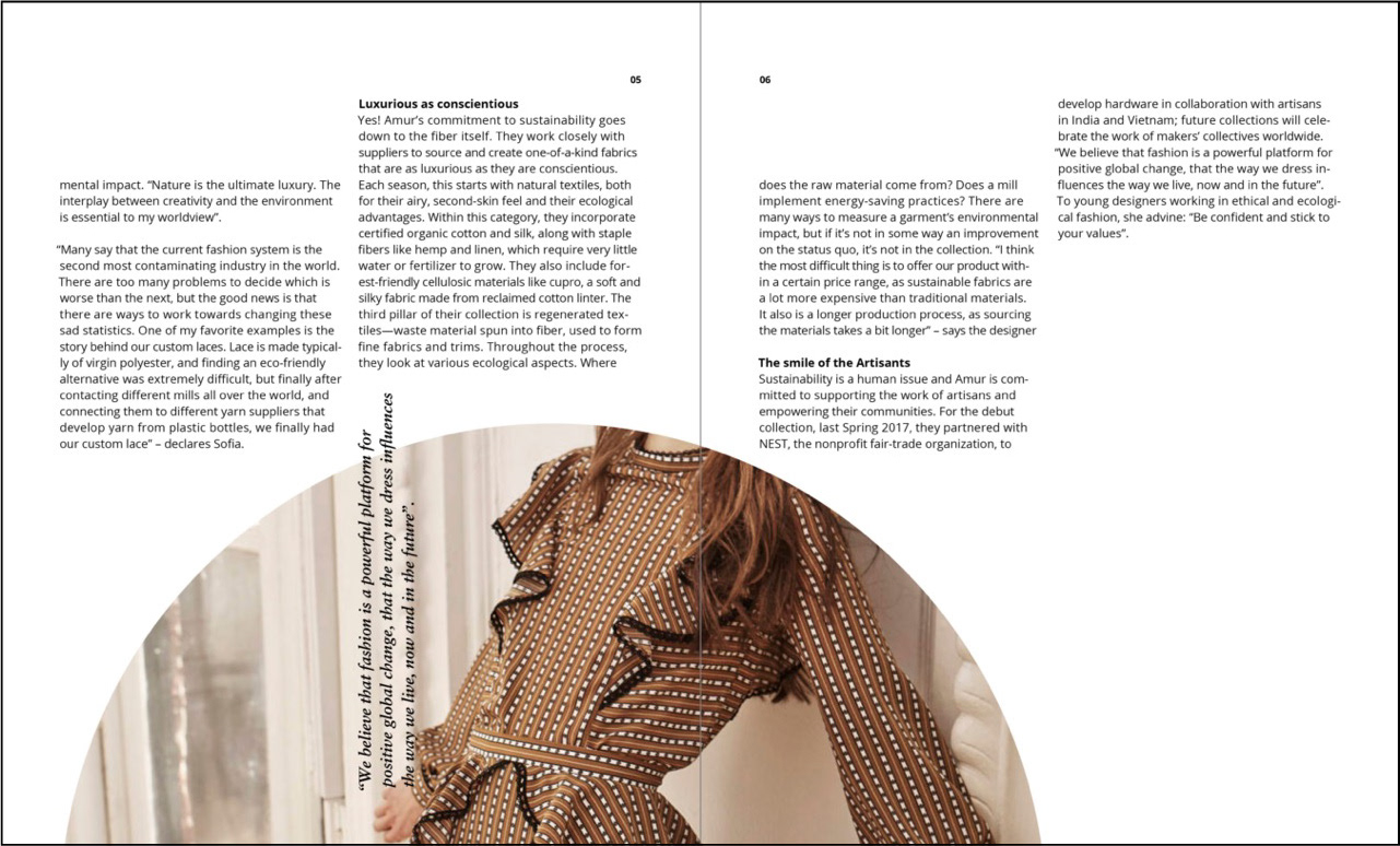
Tact is a lifestyle magazine focused on showcasing how fashion can be both luxurious and sustainable. Tact defines luxury as things that are fine and indulgent, providing pleasure to the senses, while sustainability is defined as methods of production or consumption that will not harm abilities of future generations. Sustainability is the need, luxury is the desire. Together, sustainability and luxury are focused, beautiful, keen, precise, and therefore tact.
The purpose of tact is to present readers with insight into the innovations and nuances of the sustainable luxury fashion industry. Encourage education about the importance of making choices that refrain from a negative environmental impact, without giving up the pleasures that fashion can provide.
magazine cover and interior spreads
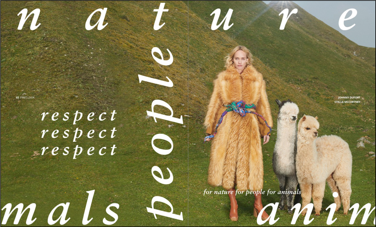
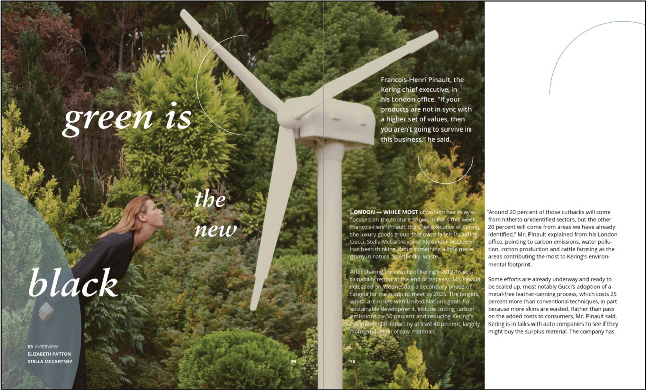
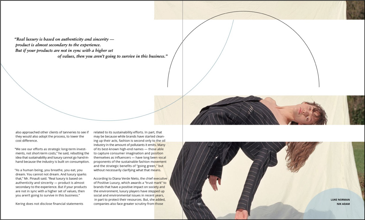
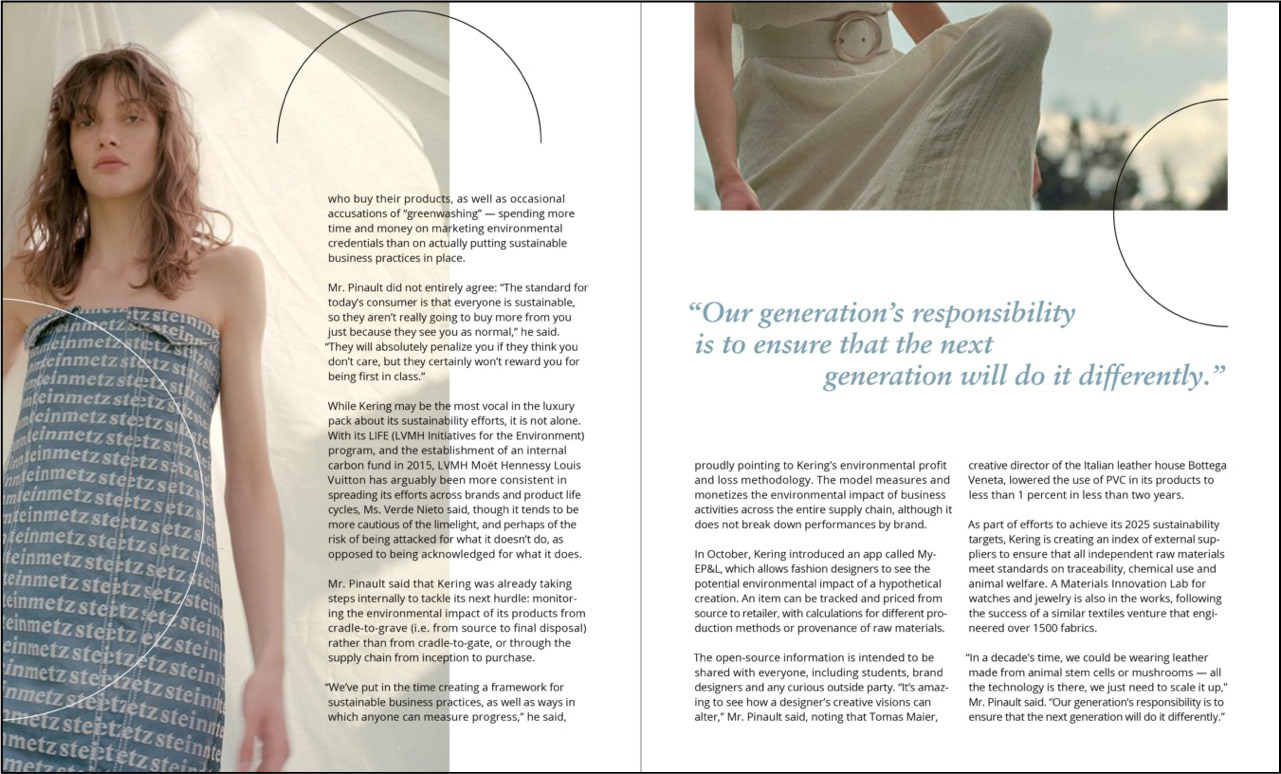
word mark process and type standards sheet
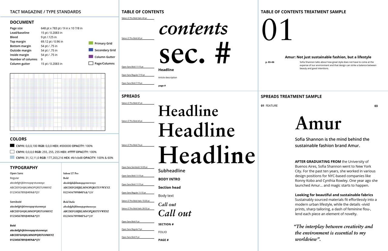
type standards sheet
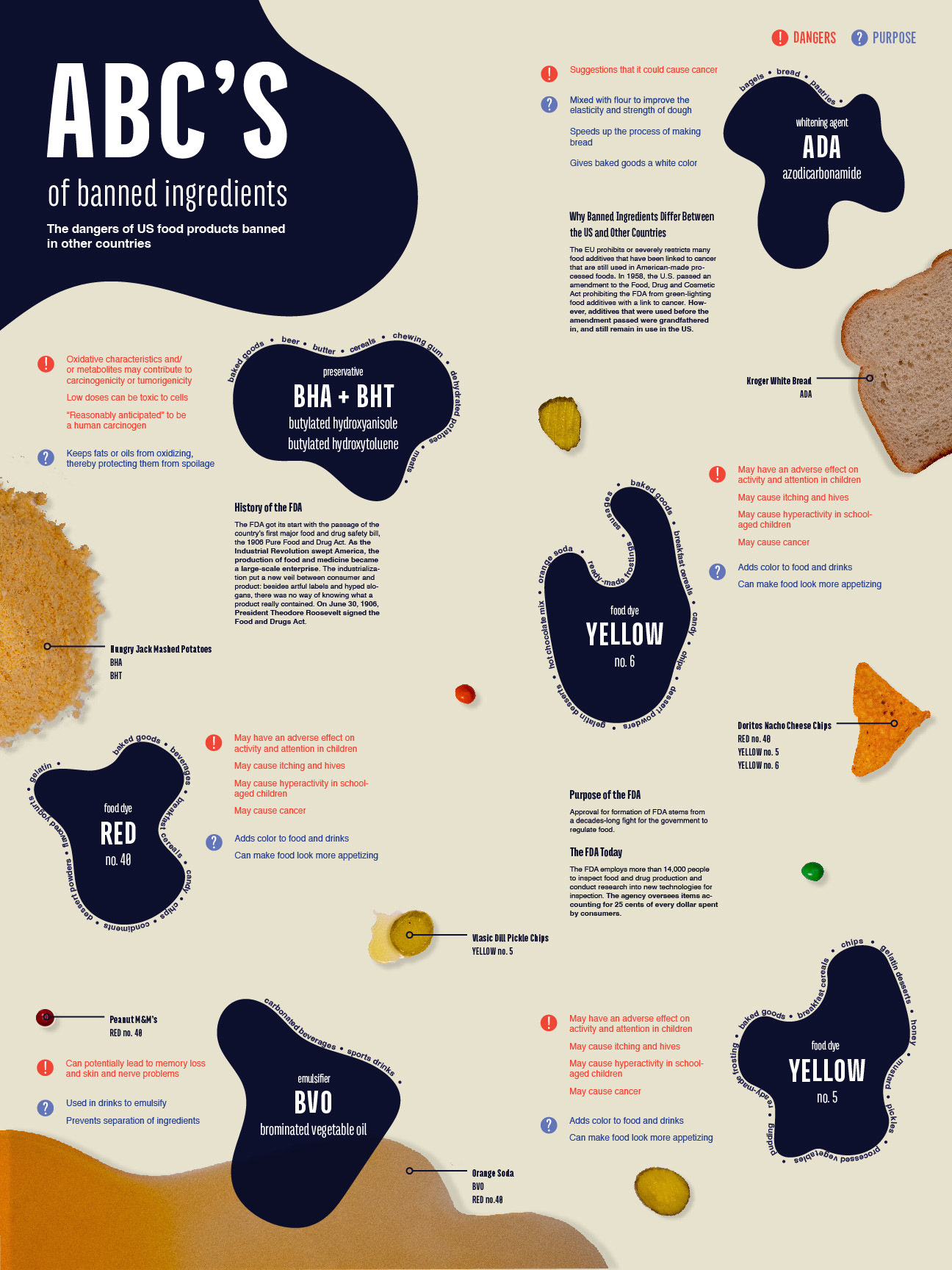
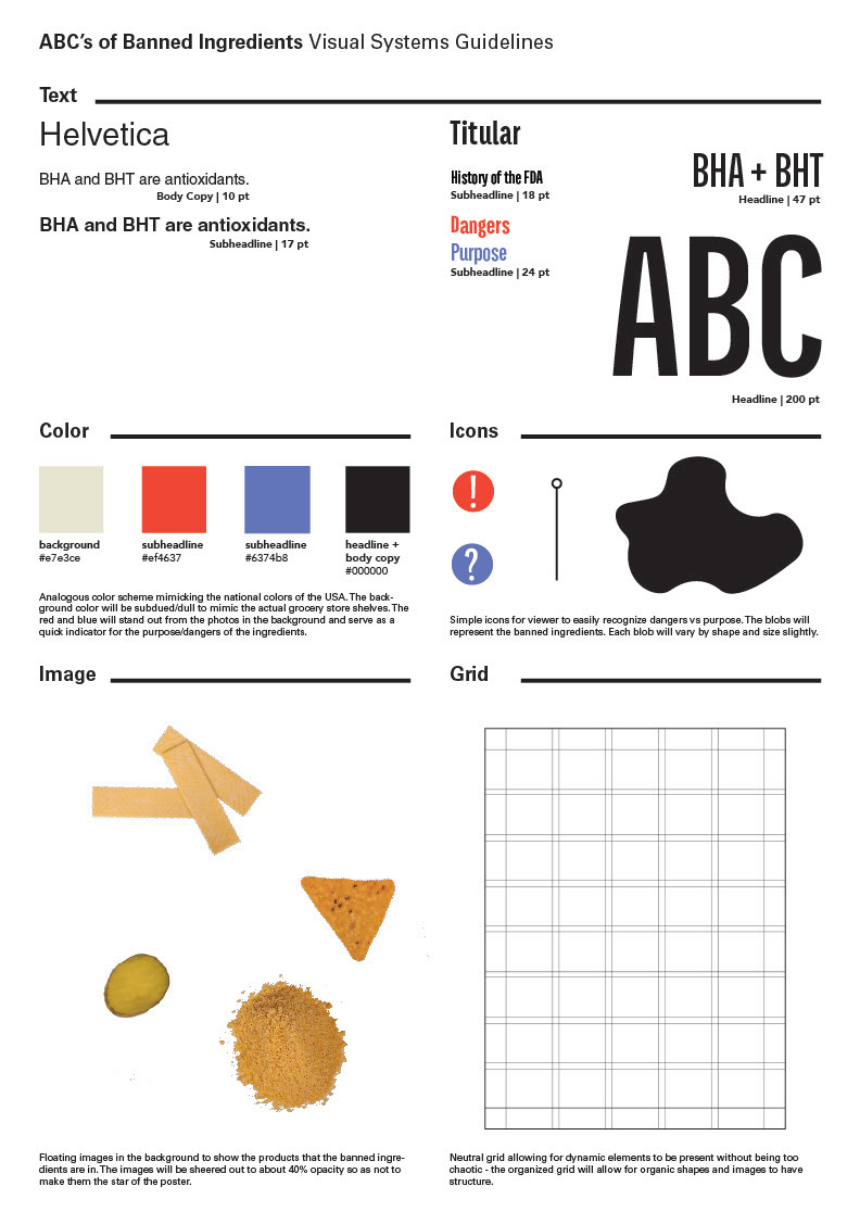
abc's of banned ingredients
infographic poster
The ABC’s of Banned Ingredients informs and educates on the ingredients found in US foods that are banned in other countries. This infographic is aimed towards an audience ready to know and form an opinion on the dangers of ingredients, particularly in packaged foods in the US. Any knowledge on the subject, whether the audience is in elementary school or retired, will hopefully provide an opportunity to make more informed decisions at the grocery store.
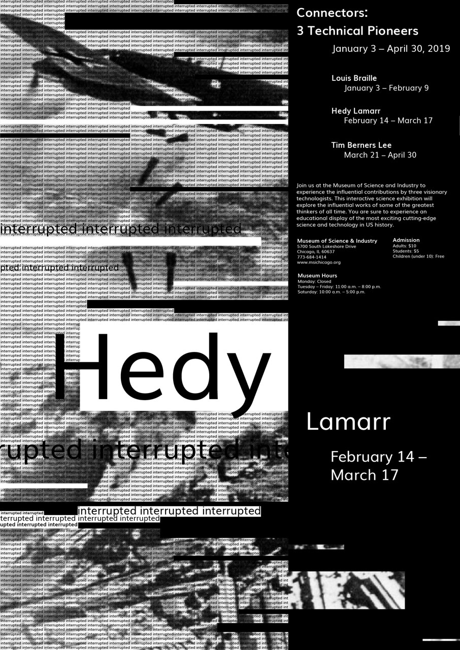
technical pioneers
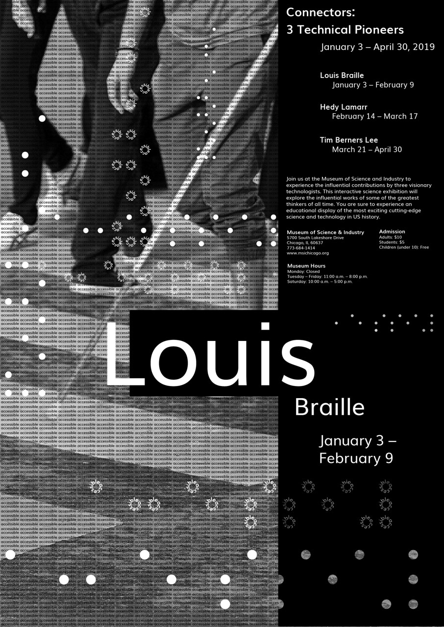
event poster triptych
Intrigue and encourage viewers to attend an event focused on the inventions and importance of 3 technical pioneers, Louis Braille, Hedy Lamarr, and Tim Berners-Lee. Invoke excitement through an innovative representation of the meaning behind each pioneer’s inventions.
The poster series focuses on the manipulation and composition of typography and image, as it conveys the idea of 'communication'. Conveying the personal connection of the inventor to each invention, as well as how each invention further connected the world was the main goal of this series. An animation was developed for Hedy Lamarr's poster to give greater context behind her invention and its lasting effects.

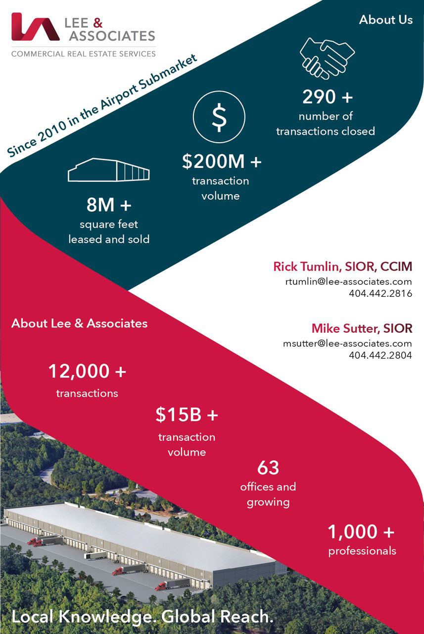
lee & associates
print and digital marketing materials
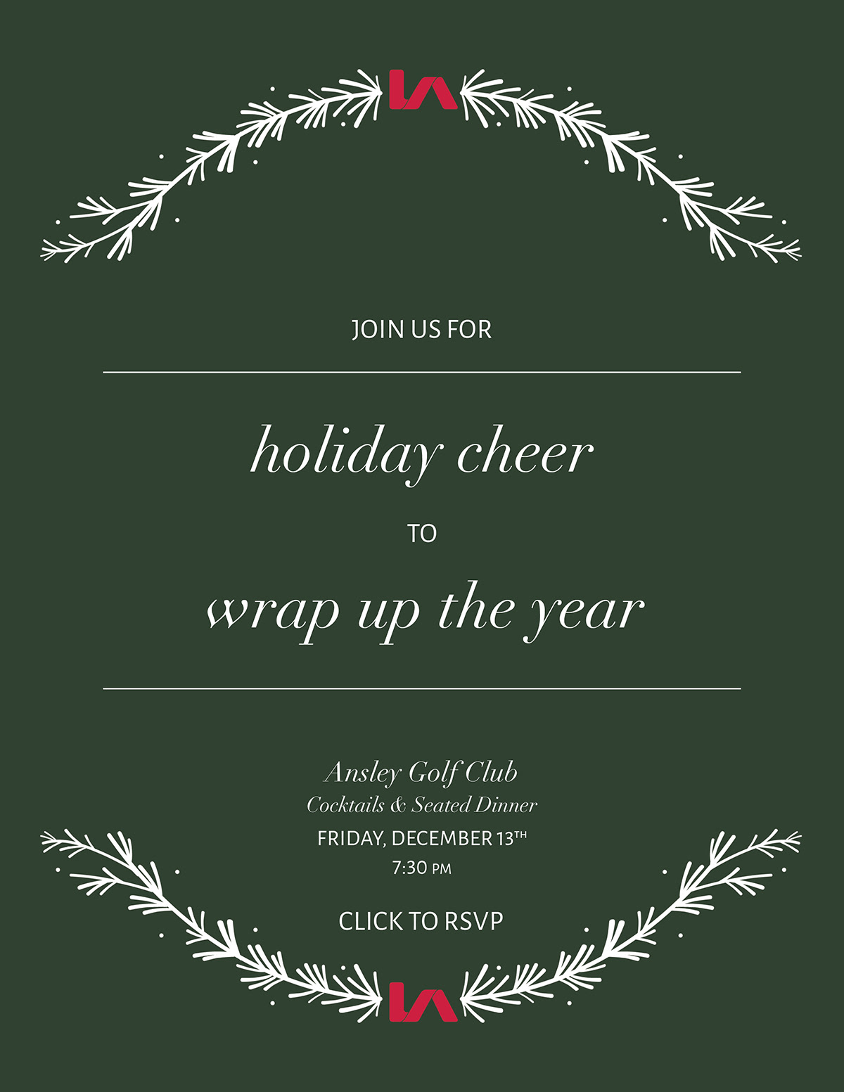
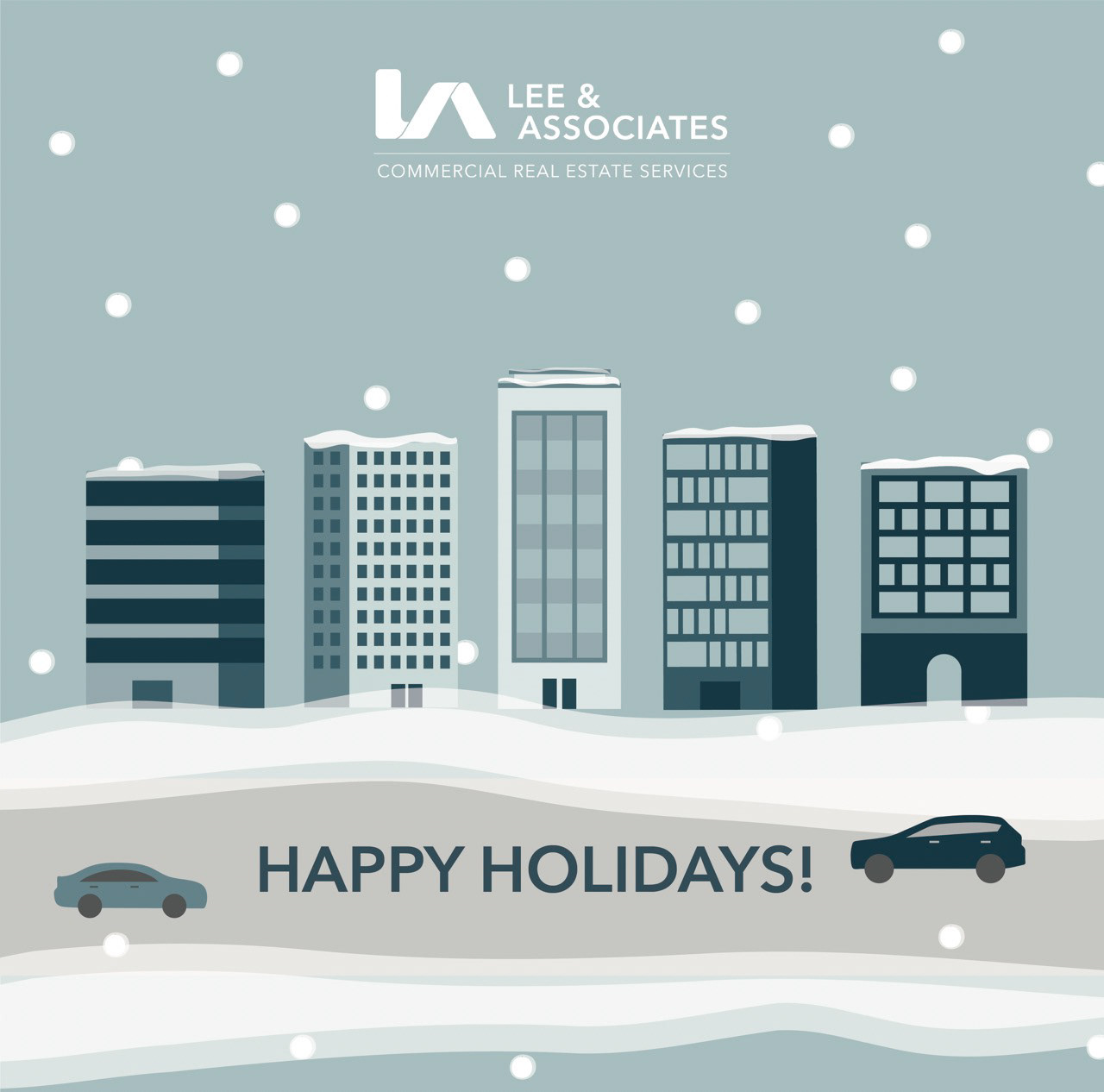
At Lee & Associates Atlanta I produced materials to help market the services of real estate brokers and property management specialists. I focused on ensuring a creative, yet consistent, look and feel that adheres to the Lee & Associates corporate brand.
Learning the jargon of the commercial real estate industry was necessary for me to understand the best method of visual communication for marketing materials. During my time at Lee & Associates I was able to develop an icon library (75+), design elements, social media images, magazine ads, custom property brochures, and various presentations. Additionally, I was able to help educate other staff members on how to use Adobe Illustrator and InDesign by leading training classes.
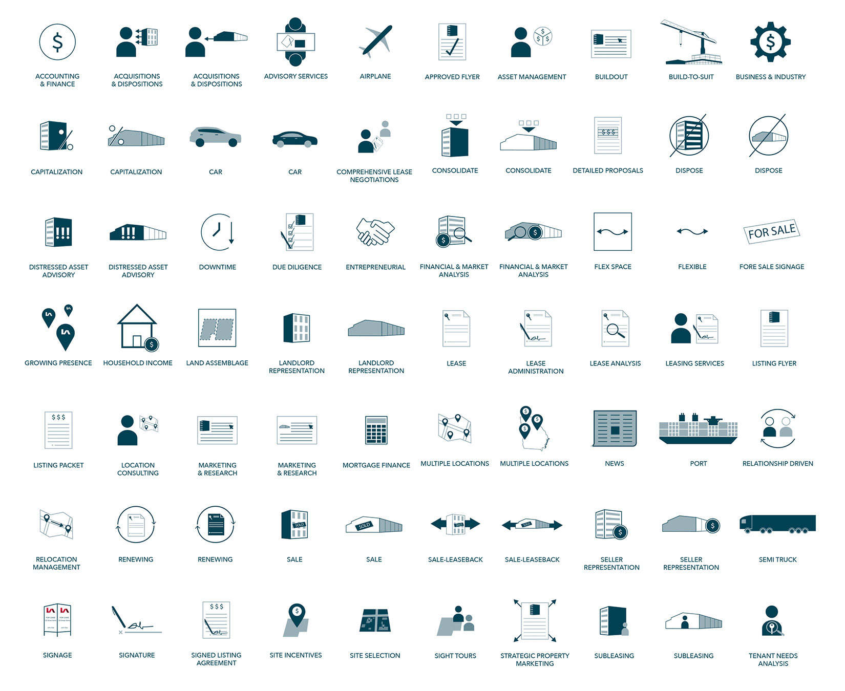
icon library
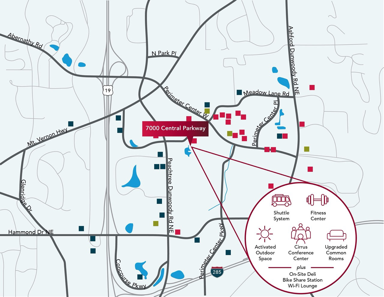
property amenity map for brochure
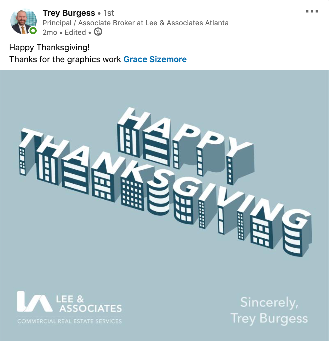
happy thanksgiving social media post
holiday party digital card
happy holidays social media image

for sublease social media image
